
5 | Score Layout

Compared with orchestral music, big band music, and jazz in general, looks remarkably different than traditional music when written down.
If you’ve come this far, I can assume that you’re just as geeky as I am about score layout and part prep. Assuming you have your own methods, templates and workflow for orchestral score preparation, I’ll be breaking down score and part layout with regards to creating big band charts. It’s not a comprehensive list of music prep do’s and don’ts but should get you started from transitioning from orchestral music to big band chart.
BASIC SCORE LAYOUT
Here are a couple quick tips about layout that should get you up and running quickly for big band charts:
The main difference between orchestral and big band scores is that big band scores are landscape.
As for paper size, A3 (Tabloid) is the most legible with a staff size no smaller than 4.5mm.
Most of the time, unless the pianist is also the bandleader, nobody will be using the full score for performance. If the pianist/bandleader wants to play off of a full score, landscape A4 (Letter) is usually fine.
Time signatures are often big, like film scores, but also found as regular, smaller ones in each staff too.
‘Casting-off’ (the amount of bars/measures per system) is usually locked at 8 bars. This is because most forms and phrases in big band charts are found in 8 bar phrases, but allowance should be made for phrases that are uneven too.
Fonts (both text and music) are usually in the handwritten style and a little more informal/stylised than orchestral scores. I’ll talk about this in worrying amounts of detail below.
Unlike film scores, key signatures are usually used if the music needs it.
Transposed scores are most common, even in the studio. Scores in C tend to leave the saxes hanging too low on the stave.
The sax, trumpet and trombone sections are grouped with a bracket each and bar lines connect them throughout.
Keep articulations above the stave. This is kind of old-school now but it keeps the scores clean and marcatos end up there anyway so might as well apply it to all articulations.
Rehearsal marks should either be letters that are never repeated, (no AA or BB rehearsal marks please!) regardless of form, or as bar numbers in a box above the stave.
Ring binding is fine, apart from studio use where it would make too much noise, then use tape.
INSTRUMENT ORDER
Like an orchestral score, the order of instruments on a score is generally a fixed thing. If you’ve read all the previous articles until now, I’ve been introducing instruments in their score order, so this shouldn’t be too unfamiliar:
Alto Sax 1
Alto Sax 2
Tenor Sax 1
Tenor Sax 2
Baritone Sax
Trumpet 1
Trumpet 2
Trumpet 3
Trumpet 4
Trombone 1
Trombone 2
Trombone 3
Trombone 4
Guitar
Piano
Bass
Drums
Sometimes, a tuba is called for, and it sits just below the bass trombone. When percussion is needed, it goes at the very bottom, below the drums. When a 5th trumpet or seperate flugelhorn is needed, it goes below the trumpet section.
If you want to know more about other expanded big band setups, like with strings and voices, and the instrument order to use, you can see my article about that here (coming soon), or for smaller ensembles read my article on writing for 3 or 4 horns in a band setting.
Here are a few examples of front pages from some scores, old and new:
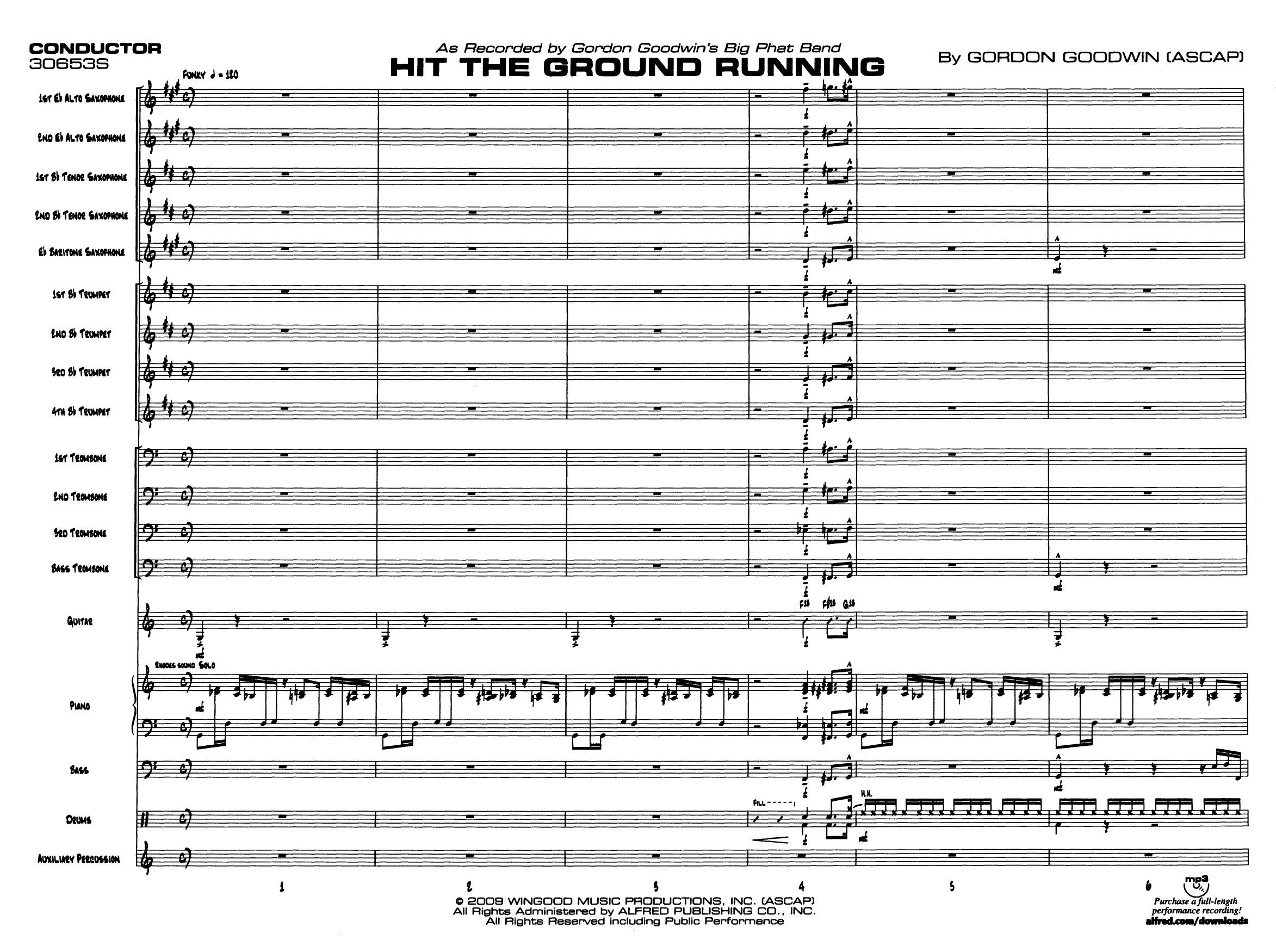
Modern Big Band Chart Layout
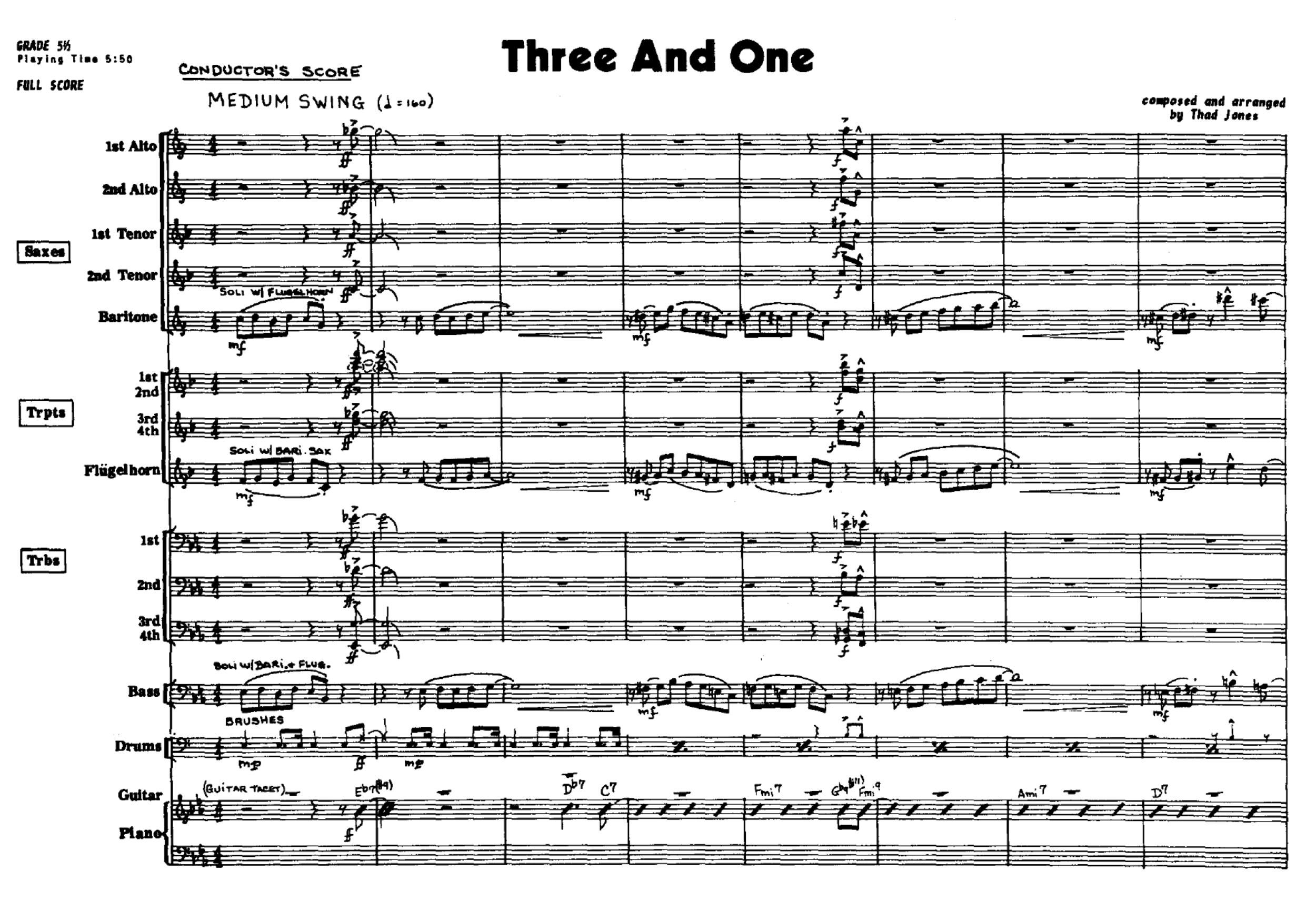
Traditional Big band Score Layout
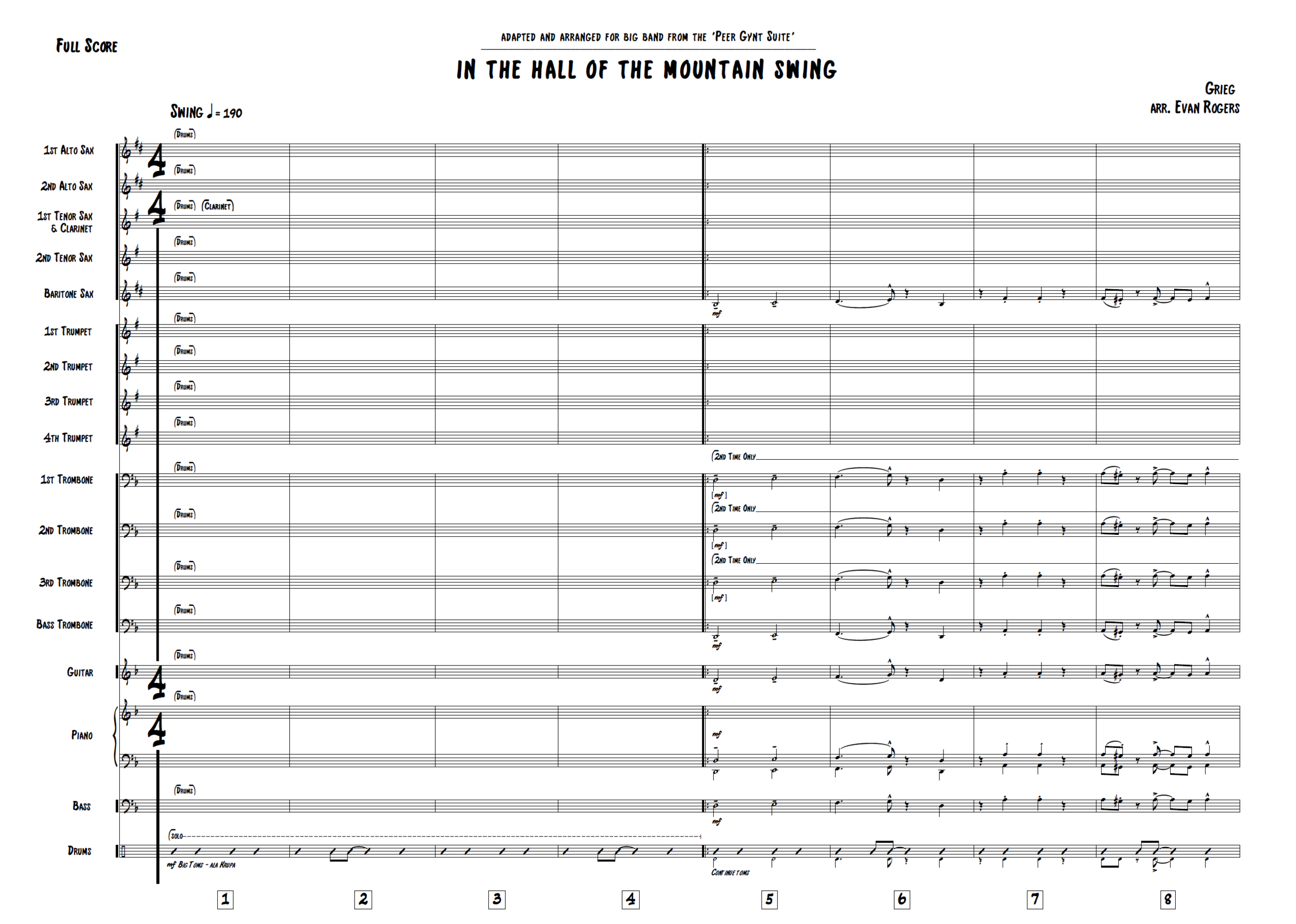
Modern Notation Software Big Band Score Layout
FONTS
In the orchestral recording world the use of computer-engraved orchestrations is a relatively recent thing. Unfortunately for the craft (but fortunately for time and money), the process of hand-engraving scores and parts seems unlikely to reappear for orchestral recordings. In jazz however the practice is still somewhat around, and the handwritten style definitely is.
One thing every jazz musician owns (and pros have pretty much memorised) is a Real Book. It’s a list of leadsheets for tunes called ‘standards’ that are all written by hand. Here’s a common standard, Stella By Starlight, and note the handwritten style:

Real Book Example
Replicating this style in both the text font and music font is the usual look for big band charts, but unfortunately, a lot of the defaults in notation software aren’t fit for purpose. Just before we look at our options for handwritten music fonts, let me get on my soapbox for a minute.
Why does the font matter? Am I really going to spend precious words dissecting music and text fonts? Why not just set everything to (shudder) Comic Sans and be done?
Font matters because the score and parts are the first lens through which another musician will see your music.
If your parts are hard to read, untidy, difficult to navigate or looks in any way less than the professionally published music musicians are used to reading, your music subconsciously becomes ‘not as good’ as that professionally published music.
That might be a bit of an overstatement if the only problem is that the font is just a bit ugly, and a lot of the time, musicians won’t know exactly what is wrong with a part, but if the font/layout cause actual performance issues, you’re just shooting yourself in the foot.
Now that we’re on the same page (terrible pun intended), let’s start with our options for the most common handwritten music fonts and check out the dos and don’ts.
MUSIC FONTS
Inkpen 2

Inkpen 2 - Phrase
Inkpen 2 is a travesty of a font. Anyone who knows me understands my aversion to it and I could go on all day so I’ll keep my rant short. Notice how the noteheads are slightly too big, which when coupled with complex chords consisting of close intervals, makes it really difficult to read. The articulations and clefs are alright but the accidentals are also very large and everything is too ‘thick’ and inky-looking when printed. I would avoid Inkpen 2 at all costs.
JzBscFIN

JzBscFIN - Music Font
JzBscFIN is similar to the ‘Jazz’ font found in Finale .This is the font I use mostly and I’d consider it pretty comfortable to read. It’s slightly more informal than the other fonts, and the accidentals can sometimes look a bit wacky but for dense scores I usually use this as the width of the noteheads allows for clear readability in measures with a lot of notes. The articulations can sometimes be a bit thin so I swap them out in some house styles with ones from Broadway Copyist (below).
Reprise

Reprise - Music Font
Reprise is the other option in Sibelius and is thankfully better than Inkpen 2. Everything seems a bit lop-sided with Reprise (look at the accents) and makes the horizontal spacing of the score more cramped than other fonts. I’d probably go with another option, but if you don’t want to pay for/download third-party fonts and you’re using Sibelius, I’d recommend this over Inkpen 2.
Broadway Copyist

Broadway Copyist - Music Font
A good font that doesn’t come packaged with any notation software I’d recommend looking into Broadway Copyist. It’s slim, the accidentals work nicely, and the accompanying text font is nice. It’s also a good mix of handwritten and typeset, so is pretty easy to read. The clefs look a bit like someone slipped while drawing with their non-dominant hand (that’s something Inkpen2 at least got right), but you can always swap those out.
Dorico
In Dorico, as of writing, fonts need to be SMuFL compatible. That means we can’t easily swap out music fonts like we can in Finale and Sibelius as we do with text fonts. Dorico comes bundled with the Petluma jazz font designed by Anthony Hughes. Unfortunately, there’s really no other option that works in Dorico without some messing around yet, but some great SMuFL-compatible ‘Real Book’-style fonts are very soon to be available at NorFonts (and they’re already compatible with Finale and Sibelius).
For more Finale and Sibelius fonts (and Dorico in the future), you can buy/download/compare all these music fonts, and search for more at Elbsound.
TEXT FONTS
Most of these music fonts have corresponding text fonts that come with them. Again, I stress the importance for a professional, readable end result to make sure your music is taken seriously.
One thing I do find useful for big band charts are fonts that don’t have a large first letter when capitalised. When you read this sentence right now, with this font, you notice that capital ‘A’ and lowercase ‘a’ are different heights. A lot of these handwritten fonts are all capitals by default and I prefer to have a font that stays roughly the same size, regardless of being upper or lower case.
Another useful feature are the square/rounded brackets over text that we see in the Real Book and other big band charts. That’s pretty nice to have, but only some text fonts offer it as standard.
I use Broadway Copyist You can make your own mind up with a comparison:
Inkpen 2

JzBscFIN

JzBscFIN - Music Font
Reprise

Reprise - Text Font
Broadway Copyist

Broadway Copyist - Text Font
There are some other things you can do to make scores look a bit more ‘pro’ like changing the staff line width and note spacing but that’s a bit extra if you’re just interested in arranging. I won’t go into detail with that kind of thing here. Of course, if you want to replicate that authentic Finale-feel just close your eyes and drag symbols around the page at random until everything collides and the part is near-unreadable (only (half-)joking Finale-users!)
PART LAYOUT
Everyone plays from their own part in a big band - no sharing. Saying that, I have been asked to include pairs of instruments like Alto 1 & 2, Tenor 1 & 2 etc. all on one part occasionally but that’s really rare; they won’t be sharing a stand.
The same principles of normal, good part preparation apply here, with a few extra tips:
Keep the staff size about 7.0mm - absolute minimum 6.0mm.
Page turns should be minimal and easy to do. Give time for players to turn pages if there’s more than 3 pages in a part. This goes double for drum parts. Leaving space to change every odd page is good practice.
Chord changes and slashes should be given to horn players you intend to take solos, not anyone else. Rhythm section players will get these by default.
Make sure repeats aren’t over page turns. Big band charts use a lot of signs like repeats, segnos and other navigation devices. Nothing is more annoying than having to repeat a section 4 times and doing 4 page turns over a break.
The ‘casting-off’ of a part should not be strictly 4 bars per system, but should make sense musically and proportionally. I suggest aiming for 4, 6, or 8 bars per system, apart from when it ruins a phrase, and try to start double bars/new phrases in the middle of systems, or on a new one completely, rather than the last bar or something.
Try not to split ties/runs over system breaks unless absolutely necessary. Musical ideas that belong together should appear together on the part as much as possible.
Change enharmonic spelling for the player.* Sure, it’s correct to put a B double-flat in a Cdim7 chord but you don’t score points for getting chord spelling correct - you only lose points if the player messes up.
Aim for about 10 staves/page, with about 8 on the first page.
*I could write a whole article on the issue of enharmonic spelling because there are so many exceptions to what I just said. For example, with a common arpeggio or scale it can be easier to read double sharps and flats; a conductor or bandleader might want to see correct spelling on the score for rehearsals; or in the case of string instruments, a cellist playing the lowest note of a first inversion chord for example will tune differently if you write B# or C natural. Just use common sense with this one.
Check out what I’d consider a bad part and then a good part below. I’ve tried to keep the bad part not so bad that the flaws are obvious. It’s a realistic part that could be given to players but could still be improved.

Bad Part Example

Good Part - Example
KEY SIGNATURES
I should quickly mention the conventions on using key signatures in big band charts. In film/game/TV scores, and most recording situations we don’t use them. Players are sight-reading and notes are changed all the time; it’s easier to see each accidental when it appears. In big band charts though I usually always use a key signature, even when recording. It’s rare to find big band music that doesn’t have a tonal or modal center and the highly chromatic nature of the music makes parts with no key signature very long as accidentals take up a lot of horizontal visual space.
As for which key signature to use in modal settings: Generally, you want to keep your key signature in line with whatever the main tonal centre is. If the tune is a D blues, I’ll write the key as D major and use C naturals and F naturals as necessary. If it’s D dorian, I’ll use a D minor key sig and use B naturals when needed.
At a quick glance, a player can see from the key signature and any accidentals if the tune is modal or not. For example, a tune in E major covered with A#’s will most likely be based on E lydian. It would be annoying to read a chart in E lydian that has a clear tonal centre of E with a B major key signature, even though that would result in fewer accidentals.
SPECIALIST NOTATION
There are a few symbols and notational devices that are commonplace in big band charts, and less so in orchestral scores. To wrap this article up, I’ll go through a few important ones in turn:
Slash Notation
Slash notation means a few things. Here I’m using it to mean the one-per beat symbols that replace the music in a bar and tell the player to do one of a few things:
Slash notation with chord symbols in a rhythm part. Without the word ‘solo’, this means an accompaniment part. Exactly what the musicians will play varies per instrument and style, but they’ll improvise and ‘comp’ (accompany) as a section under the horns.
Slash notation with chord symbols in a horn part. This means that there’s an option to take an improvised solo. Usually this section is repeated and two or more musicians will take a solo, usually decided in advance.
Slash notation on drum parts. This means the drummer will play ‘time’. Playing time means playing a beat/groove that fits the style and context.
Here’s what slash notation looks like in a bass part. As the style is a medium swing, I’ve shown the kind of thing the bassist might play, ‘walking’ around the chords:

Slash Notation Example

Slash Notation Played
Bar Repeats
This symbol indicates that you should repeat the bar you’ve just played. Variations also include repeating the last 2 bars and last 4 bars. It’s useful for drums and repetitive riffs in the rhythm section. It would be fairly uncommon to use it for horns, but they’d understand what you mean.
The one thing to watch out for this is a pet peeve of mine as a bass player. Let’s say you’re given a riff or groove to play that’s 2 bars long, and then just a series of these 2-bar repeat symbols follows. After sight-reading the riff for the first time, I haven’t memorised it, so seeing the repeat marker doesn’t actually help. I have to keep checking back to the first 2 bars until it’s under my fingers, risking losing my place in the never-seen-before music. Make sure the groove/riff is established for rhythm players before using these markers.
Here’s a repeated riff that benefits from repeat markers because it’s simple to read and play. You wouldn’t have to keep checking back to see what the riff was. The top stave is the notation and the bottom stave is how the bassist would play it. Notice the small ‘4’ indicating to the player how many times they’ve played it:

Repeated Riff Notated

Repeated Riff As Played
If the riff were 2 or 4 bars instead of 1, it could be repeated with these symbols instead:

2-bar Repeat

Navigation Symbols
Form and structure in a traditional big band chart is a very fixed thing. The sections are 8, 16 or 32 bars and usually have a strophic (song) form that looks something like this:
Intro
A
A
Solos
B
A
Outro/Coda
Because of the repetition of sections, it’s very common to include repeats and 1st and 2nd time bars. Older charts will use da capos and da segnos, but I advise against this, especially for recording. It makes navigation difficult and page turns awkward. Less people will go wrong if they’re sightreading and the music is straightforward, or only includes simple repeats.
